
Bold Barrels Living Room
Bold colors don't have to feel overwhelming...they just need a strategy. This living room layers jewel tones over a calm neutral base, letting each color breathe instead of competing.
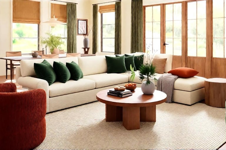
THE FORMULA
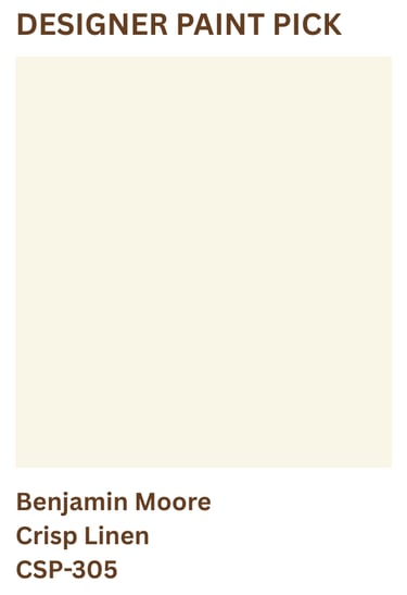
Paint: Warm ivory walls provide a calm backdrop for the room’s dark olive green accents. Skip cool whites or stark neutrals...they can make the green feel disconnected. Look for soft ivory undertones that keep the room feeling warm, balanced, and inviting.
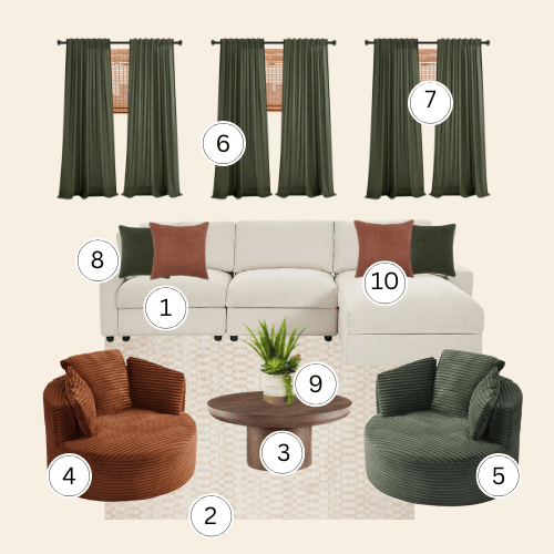
Furniture: The cream L-shaped sectional anchors the room and gives the jewel tones somewhere to land...its neutral upholstery lets the forest green and rust chairs do the color work without the whole room feeling saturated. The two corduroy barrel swivel chairs are the room's most deliberate choice...one forest green, one rust, balanced on either side of the conversation rather than stacked in one corner. The round walnut pedestal coffee table connects the warm rust tone to the bamboo shades above.
Lighting: Bamboo roman shades layered with forest green linen curtains create a window treatment that filters light into warm diffused tones while pulling the chair color up to ceiling height. This vertical color lift keeps the jewel tones from sitting too low and heavy. Warm bulbs at seated height, never overhead alone.
Materials: The cream geometric area rug grounds the seating group without introducing another color...its subtle texture keeps the floor quiet enough for the chairs to read clearly. The terracotta and forest green linen pillows, on the sectional, bridge the two chair colors back into the sofa. The faux succulent adds the organic element that keeps the jewel tones from feeling too formal.
DESIGNER'S NOTE
This room works because the color is controlled, not cautious...two jewel tones only succeed when everything around them commits to neutrality. The cream sectional, warm walls, bamboo shades, and geometric rug are deliberately quiet so the forest green and rust can be genuinely bold without overwhelming the room.
The corduroy texture on both chairs is doing more work than the color alone. Its ribbed surface catches light differently throughout the day...the same forest green chair reads almost muted in morning light and richly saturated by evening. That material depth is what separates a room that feels designed from one that just feels colorful.
THE NEVER GUIDE
Never use cool white or gray walls here. Cool walls will make the forest green feel cold and the rust read garish...warm cream only, with yellow or sand undertones.
Don't add a third color anywhere in this room. The forest green and rust are already in conversation...introduce a third tone and the room loses the clean intentional pairing that makes it work.
Never stack both colored chairs on the same side. The balance of this room depends on the green and rust anchoring opposite ends of the sectional...grouping them together collapses the color distribution and makes one half of the room feel heavy.
Skip patterned textiles on the sectional. The corduroy chairs are already providing texture and color. A patterned throw or printed pillow on the cream sectional will fight rather than support them.

Three Homes Design participates in various affiliate marketing programs, which means we may earn a commission on products purchased through our links at no extra cost to you.