
Modern Rustic Living Room
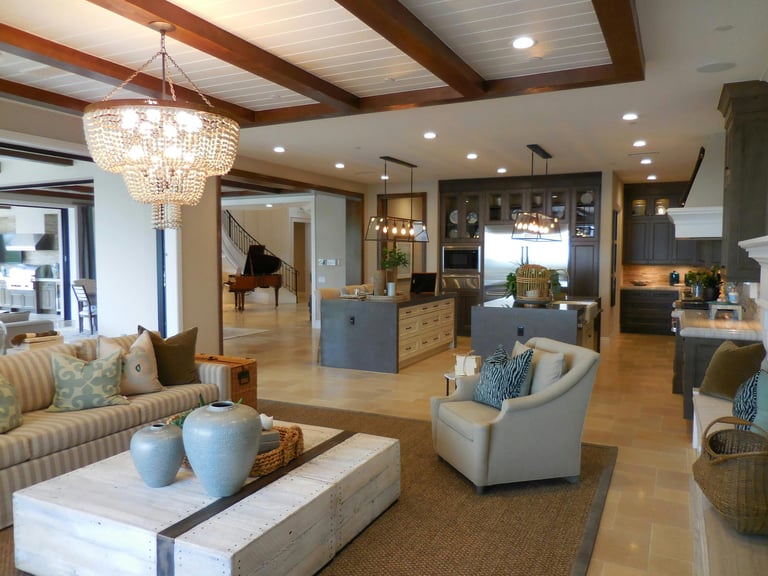
Exposed beams, natural fibers, and soft blues balance casual ease with a quietly elevated hand.
THE FORMULA
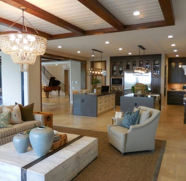
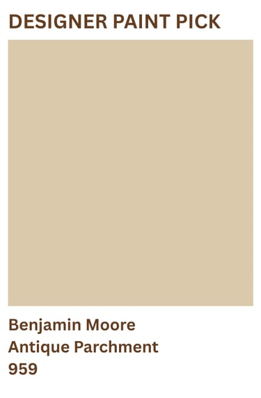
Paint: A soft parchment-toned neutral creates the warm foundation that allows the room's architecture to shine. Its creamy undertones soften the contrast between dark wood beams, natural stone, and woven textures, creating visual continuity throughout the space. Unlike stark white, it adds warmth without becoming yellow or heavy. The result is a living room that feels bright, welcoming, and quietly refined.
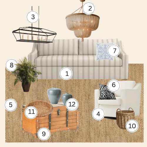
Furniture: A cream swivel chair anchors a cozy conversation zone and softens the wood architecture without fighting it. A striped sofa in neutral tones keeps the seating cohesive while the pattern adds quiet movement. Layer in a woven storage basket in a corner to add texture and function without blocking sightlines.
Lighting: A beaded chandelier draws the eye upward to the beams and adds warmth after dark. Pair it with island-style pendant fixtures in matte black to layer ambient and task light at different heights. The contrast of black metal against warm wood feels intentional, not industrial.
Materials: A jute area rug grounds the seating area with natural texture that anchors without overpowering. Layer zebra print pillow covers for graphic contrast that echoes the striped sofa without disrupting the natural palette. A wicker tray and ceramic vases on the coffee table finish the surface with handcrafted texture at eye level.
DESIGNER'S NOTE
Modern rustic walks a fine line between refined and lived-in. The exposed beams are architectural...they're not decorative, they're structural. The cream swivel chair isn't precious; it's functional and comfortable. The round side tables and ceramic vases are chosen for their form and craftsmanship, not their trend value. The zebra pillow adds personality without chaos...it's a deliberate nod to pattern without overwhelming the neutral foundation. The result is a room that feels both effortlessly comfortable and intentionally curated. A space where family gatherings and quiet mornings both feel equally at home.
THE NEVER GUIDE
Never paint the beams white or match them to the ceiling. The beams only work as an architectural feature when they contrast with the ceiling. Painting them out flattens the room and loses the entire design foundation.
Never use cool-toned neutrals on the walls. Gray or blue-based whites fight the warmth of natural wood and make the room feel disconnected. Stay with warm creams, parchment tones, and soft linen-inspired neutrals so the beams, stone, and natural textures feel layered and inviting.
Never mix patterns in competing color families. This room layers zebra, stripes, florals, and multiple textures successfully because every piece stays within the same warm neutral palette. The moment you introduce a pattern in a contrasting color, the collected feeling falls apart.
Never confuse shine with wrong finish. Ceramic and glazed vases work here because they're organic in form...it's chrome, lacquer, and high-gloss furniture finishes that break the handcrafted feeling. Let the shine come from natural materials, not manufactured surfaces.
THE EDIT: A CLOSER LOOK

Three Homes Design participates in various affiliate marketing programs, which means we may earn a commission on products purchased through our links at no extra cost to you.