Color Psychology
Warm color is one of the quietest forces in a room...and one of the most powerful.
Color is one of the quietest forces in a room. It doesn't announce itself the way furniture does or demand attention the way art does. It simply settles into the background and changes how everything feels. Warm tones...reds, oranges, golds, browns, terracotta...do this more viscerally than most. They signal comfort, connection, and permanence in a way that cooler palettes rarely achieve. Used with intention, they can turn an ordinary room into one that feels genuinely hard to leave.
Start With One Warm Anchor
The most common mistake with warm color is trying to introduce it everywhere at once. The better approach is to choose one dominant warm tone and let everything else build around it. A warm oak floor. A buttery neutral on the walls. A soft caramel sofa. That single anchor sets the emotional temperature of the room and gives every other element something to relate to.
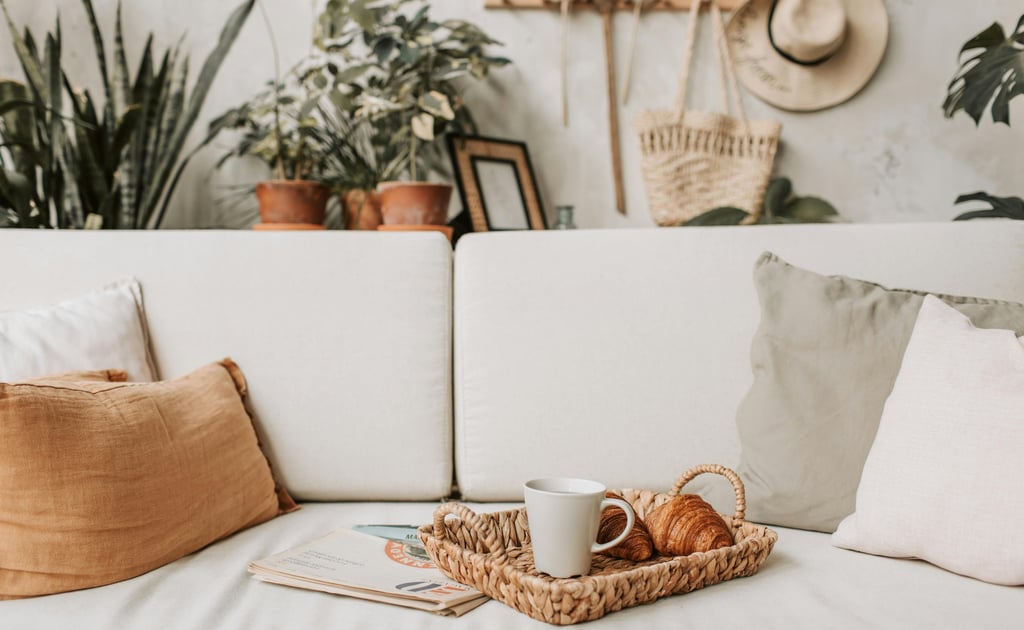
From there, depth comes from layering...rust pillows against a warm beige sofa, an amber glass lamp on a wood console, a terracotta vase on a linen-covered shelf. Each addition deepens the warmth without overwhelming it. The goal is a room that feels like it was always this color, not one that was recently painted.
Warm Color by Room
Different rooms ask for different registers of warmth. A living room benefits from golden beige, warm greige, or muted terracotta...tones that make a seating area feel connected and unhurried. A bedroom calls for something quieter...warm taupe, soft blush, or a muted cinnamon that encourages rest rather than conversation. A kitchen can carry more energy...clay, warm white, muted yellow...especially when paired with wood accents and natural fiber details that reinforce the warmth through texture as much as color.
The through line in all of them is restraint. Warm tones should embrace a room, not saturate it.
Pair Warm Color With Natural Materials
Warm colors and organic materials share the same visual language. Wood, rattan, linen, and clay have undertones that harmonize naturally with earthy palettes because they come from the same source. A terracotta vase on a walnut console. A woven jute rug anchoring a cream sofa. A linen throw in warm oatmeal draped over the arm of a chair. Each combination adds another layer of warmth that paint alone can't achieve...because the materials themselves are carrying part of the color story.
Warm Doesn't Mean Dark
This is the hesitation that stops most people. They assume warm color will make a room feel smaller or heavier and default to cool whites instead. But warmth is about undertone, not depth. Cream, honey, sand, and pale clay all radiate genuine warmth while keeping rooms light and airy. A room furnished in warm neutrals with good natural light will feel sunlit and calm...not heavy, not closed in.
The weight comes from dark tones, not warm ones. The two are not the same thing.
Light Is Half the Equation
No warm palette will perform without warm light to support it. Cool overhead lighting flattens color and strips the life out of even the most considered room. Swap bright white bulbs for soft warm LEDs in the 2700K–3000K range and the same room reads entirely differently...richer, softer, more inviting.
Layer the light sources wherever possible. A table lamp for intimacy, a wall sconce for softness, a candle or two for evening. Warm light doesn't just illuminate a room...it activates the color already in it, deepening every tone and making the textures around it come alive.
Let Neutrals Do the Balancing
If your home currently leans cool...gray furniture, white walls, clean-lined pieces...warm color doesn't require a full commitment to make an impact. A rust throw pillow on a gray sofa. Artwork with warm undertones. A wood or bamboo tray on a marble coffee table. Warm accents layered into a cool neutral palette shift the feeling of the room without changing its bones. Start there and see how much the room changes before deciding whether to go further.
Warmth in a home is less about a specific color and more about a specific feeling...grounded, unhurried, and genuinely comfortable. The right warm tone, in the right room, with the right light, creates something that no amount of clever styling can manufacture. It just feels like home.