Taupe and Teal Bedroom
Warm and cool tones are opposites, but this bedroom shows they don't have to clash. Taupe and teal work in harmony when each is given equal weight, creating a space that feels both grounded and alive.
THE FORMULA
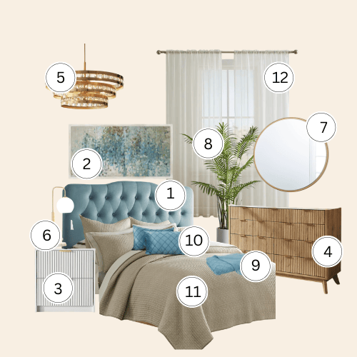
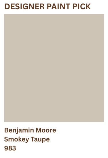
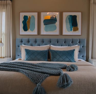
Paint: Warm mushroom-taupe walls are the foundation of this room. They bring enough depth to balance the cool teal without feeling dark or heavy. This matters because teal can feel isolated when paired with stark neutrals. Smokey Taupe's gray-brown undertones create visual continuity, making the teal feel intentional rather than accidental. The warmth grounds the palette while maintaining the sophisticated contrast that gives the room its energy.
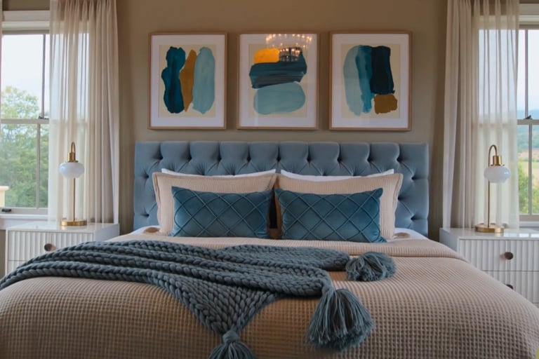
Furniture: Light wood introduces organic grain and warmth that echoes the walls. The natural oak fluted dresser and nightstands repeat the vertical line work of the headboard...this repetition creates visual rhythm. The light blue tufted velvet headboard is the bed's architecture...the tufting creates shadow and depth that prevents the color from reading flat. It becomes a sculptural element, not just a color block.
Lighting: Gold industrial lamps on either side anchor symmetry. Symmetry in a bedroom reads as intentional, restful. The cascading crystal chandelier overhead breaks the predictability...it adds verticality and drama. The gold metallics tie the warm taupe and cool teal together...they're the connective tissue that makes both colors feel chosen.
Materials: Ivory linen curtains in pinch pleats create texture without competing. Teal diamond quilted pillows layer the color in a pattern that gives it structure and geometry...solid teal would read as color for color's sake. The chunky knit throw in dark teal adds weight and prevents the bed from feeling weightless. Abstract art in teal, gold, and warm tones echoes the entire palette...nothing feels isolated.
DESIGNER'S NOTE
Taupe and teal succeed because they're opposites on the color wheel, but taupe's warmth softens teal's coolness...they don't clash, they resolve. The room works because each element has a job. The gold doesn't just look pretty...it bridges warm and cool. The pattern in the pillows isn't decoration...it's structure. The wood isn't filler...it's repetition that grounds the color story. A bedroom with taupe walls and scattered teal pieces feels confused. This room feels resolved because each texture, each material, each metallic finish was chosen to support the central idea: warm and cool in perfect balance.
THE NEVER GUIDE
Never use a blue-based taupe on the walls. Cool taupe tips the whole room toward gray and fights the teal instead of warming it. Look for taupe with brown or wheat undertones...the warmth is what makes the contrast work.
Never introduce teal in more than three places. Headboard, pillows, and one textile is the ceiling. Beyond that the room loses its taupe foundation and starts reading as a teal room with taupe accents...the opposite of the intention.
Never use chrome or silver hardware. It reads cold against this palette. Gold and brass only...they're the connective tissue between the warm walls and cool headboard.
Never use stark white bedding. It breaks the warmth immediately. Cream, oat, and soft ivory keep the palette cohesive from wall to bed.