Styled Shelves
A shelf that looks curated is the result of ruthless editing...and understanding that empty space is just as important as what you display.

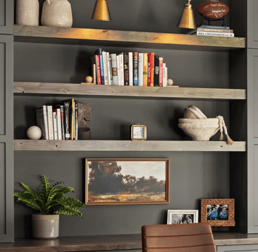
Bookshelves are one of the most visible surfaces in a home...and one of the most neglected. Most people load them up with books, shove in a few random objects, and move on. The result is a shelf that looks busy but not intentional, full but not finished. Designers approach bookshelves completely differently. They treat every shelf like a small composition, thinking about balance, contrast, height, and breathing room before a single object goes back in place.
Start by Taking Everything Off
This step feels counterintuitive but it matters. Trying to restyle a shelf around existing clutter is like trying to repaint a room without moving the furniture. Clear everything off, wipe the shelves down, and start fresh. Once you're looking at empty shelves, you can actually see what you're working with.
Before anything goes back, take a moment to edit what you pulled off. Not everything deserves to go back up. Set aside anything that feels dated, broken, or like it just ended up there by accident. What's left is your starting point.
Think in Sections, Not Shelves
One of the most common mistakes is treating each shelf as its own separate project. Designers think about the whole unit as a single composition divided into sections...usually thirds. Left, center, and right. When you stand back and look at a finished shelf, your eye should travel across it naturally, not get stuck in one corner or bounce around randomly.
Within each section, vary the height of what you're placing. A tall vase next to a stack of books next to a small object creates movement. Three things of the same height sitting in a row creates a flat, static look that reads as an afterthought.
Use Books as the Foundation, Not the Whole Story
Books are essential on a bookshelf...but they work best as a backdrop and a base, not the entire display. A shelf packed solid with books from end to end looks more like a library than a styled space. The goal is to mix books with other elements so the shelf feels layered and lived-in.
Try a few different approaches with the books themselves. Stack some horizontally to create a small platform for an object on top. Turn a few spines inward for a cleaner, more editorial look...this works especially well if you have books with mismatched or distracting covers. Group books loosely by color if you want a more polished feel, or keep the mix casual if the room has a more relaxed vibe.
Layer In Objects Thoughtfully
The objects you choose and how you place them makes the difference between a shelf that looks curated and one that just looks cluttered.
The best shelves include at least three categories of objects: something tall, something with organic or sculptural shape, and something small with interesting detail. A tall candlestick, a round ceramic vase, and a small stack of art books with a tiny object resting on top covers all three. That combination alone creates visual interest without feeling overdone.
Vary your materials deliberately. Ceramic next to wood next to metal...matte next to shiny...smooth next to textured. When all the objects on a shelf share the same material or finish, the shelf loses dimension. Contrast is what keeps the eye engaged.
Plants and greenery deserve a spot on almost every shelf. Even a small trailing plant or a simple stem in a bud vase brings life to a display in a way that no object can replicate. A high-quality faux option reads just as well from across the room.
Negative Space Is Not Wasted Space
This is the lesson that separates a styled shelf from an overstuffed one. Negative space...the empty areas between and around objects...is what makes everything else look intentional. It gives the eye a place to rest. It signals that the shelf was arranged with care, not just filled up.
Most people's instinct is to keep adding until the shelf feels full. The better instinct is to keep removing until the shelf feels right. If you're not sure whether something belongs, take it off and sit with it. The shelf will usually tell you.
Bring in Texture and Dimension
Beyond the objects themselves, think about what the shelf looks like as a whole. A mix of heights creates vertical interest. A mix of depths...some objects pushed to the front edge, others sitting further back...creates a layered, dimensional look. Leaning a small piece of art against the back of a shelf instead of hanging it adds a casual, collected feel that photographs beautifully.
Baskets and boxes tucked into lower shelves serve double duty...they hide things you don't want on display while adding texture and breaking up the visual weight of books and objects on the shelves above.
The Edit
Once you think you're done, step back and really look. Stand across the room if you can. Squint slightly so you're seeing the overall composition rather than the individual pieces. Does one area feel heavier than the rest? Is there a color or shape that jumps out awkwardly? Is there a shelf that looks noticeably different from the others?
The final edit is almost always about removal. Take off one or two things that aren't quite working and see how the shelf reads without them. The best styled shelves usually end up with less on them than you'd expect...and that's exactly why they look so good.