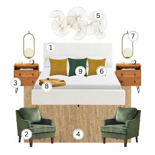
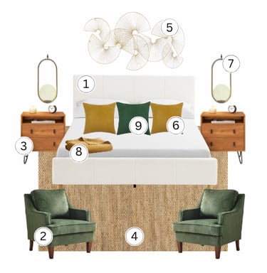
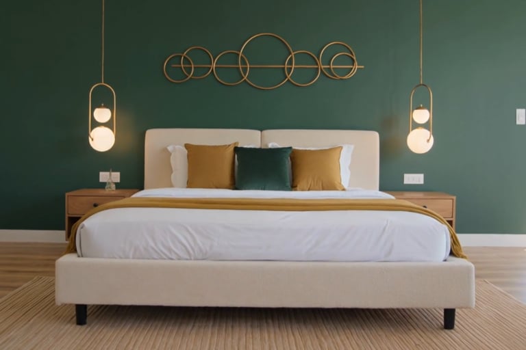
Green and Gold Minimalist Bedroom
Bold color doesn't have to mean chaos...forest green walls paired with restraint and natural materials create a space that's moody and calm at once. Minimalism with depth.
THE FORMULA
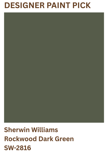
Paint: The walls here read as a rich olive-green with warm earthy undertones...deep enough to make a statement while still feeling natural and approachable. Look for greens with subtle yellow or brown undertones rather than blue or gray-based greens. The warmth in the wall color allows the brass accents, oak furniture, and mustard textiles to feel intentional and connected, creating a bedroom that feels grounded, inviting, and sophisticated.
Furniture: A cream upholstered platform bed anchors the room with just enough softness to prevent the forest green walls from feeling heavy. Minimal wood nightstands with clean lines keep the supporting furniture honest and grounded...no carved details, no metal hardware, nothing that pulls attention away from the wall color and the gold accents threading through above. Negative space is a design tool here..the less the furniture does, the more the room says.
Lighting: Gold oval pendant lights flanking the bed are functional sculpture...their geometric shape and warm metal finish do more visual work than any decorative accessory could. Hang them at eye level so the light pools at headboard height rather than washing down from above...the gold plays against the green without fighting it, adding warmth where the wall color adds depth. Warm bulbs only...cool light flattens the green and strips the gold of its warmth entirely.
Materials: A jute area rug grounds the floor in natural texture that connects the wood nightstands to the cream bedding without introducing another color. White linen bedding keeps the bed quiet so the mustard and forest green pillows read as the deliberate color story they are. The mustard throw folded at the foot of the bed pulls the gold from the pendant lights down to floor level, closing the palette loop. One gold metal wall sculpture above the headboard completes the room...not as decoration, but as the final punctuation in a very considered sentence.
DESIGNER'S NOTE
This room works because it makes one bold decision and then stops. The forest green wall is the statement...the cream bed, jute rug, and white linen exist to give that green room to breathe. Most people who attempt bold color keep adding pieces to justify the choice...another pattern, another layer, another accent. This room does the opposite. The restraint is what makes the color loud.
The gold is not an accent color...it's the architecture. The pendant lights, the wall sculpture, the mustard pillow and throw all carry the same warm metallic thread from ceiling to floor...remove any one of them and the room loses its vertical connection. This is how color works in a minimalist space...not spread across surfaces, but threaded deliberately through the room at specific points.
What separates this room from a cold, sparse space is the natural material foundation. The jute rug, the wood nightstands, the linen bedding...these are warm, honest materials that give the eye something tactile to rest on between the bold green walls and the graphic gold accents. Bold color needs natural grounding or it reads as a showroom rather than a room someone sleeps in.
THE NEVER GUIDE
Never use bright yellow-green, lime, or chartreuse on these walls. Greens with too much yellow will overpower the room and compete with the brass accents rather than complement them. Instead, look for deep forest greens with earthy, muted undertones...you want richness and depth without excessive gray. The goal is a green that feels sophisticated and grounded, allowing the warm metals, natural wood, and cream upholstery to work together effortlessly.
Skip pattern entirely. This room earns its sophistication through negative space and restraint...a patterned rug, printed pillow, or textured wallpaper breaks the minimalist premise the moment it enters. Solid, natural, and muted only.
Don't introduce a second accent color. The gold is doing all the warmth and contrast work in this room...add a second color and the forest green loses its authority as the statement. One bold choice, everything else neutral.
Never use cool or bright white bulbs here. The gold pendant lights work because they cast warm ambient light that activates the green walls...cool bulbs make the green read flat and the gold look silver...warm bulbs only, always on dimmers.