
Aqua Horizon Bedroom
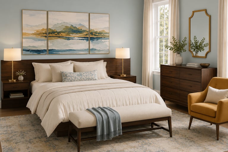
Walnut furniture reads heavy in the wrong room and grounded in the right one...this is the right one, and the wall color is why.
THE FORMULA
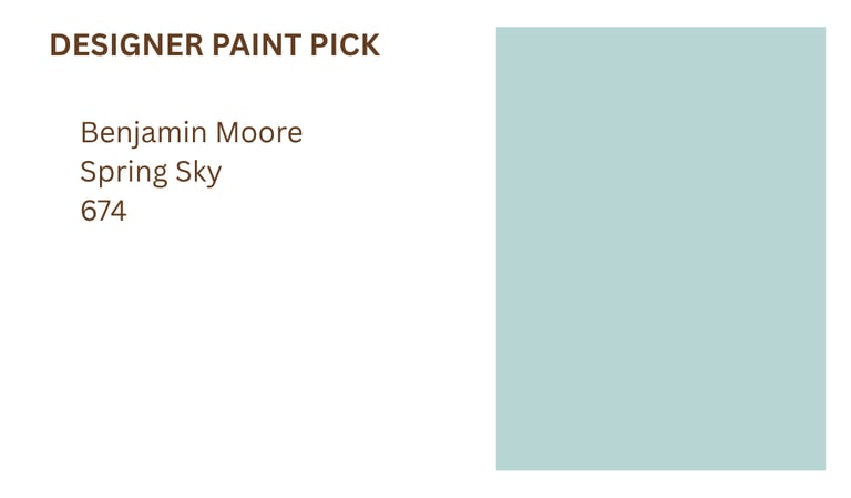
Paint: A clean, true aqua blue with a soft matte finish, bright and true rather than muted. It reads crisp and clear in daylight, then settles into something deeper and more atmospheric at night. Trim stays a crisp warm white to keep the edges sharp.
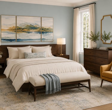
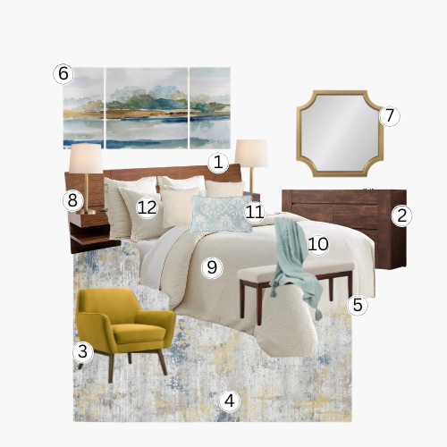
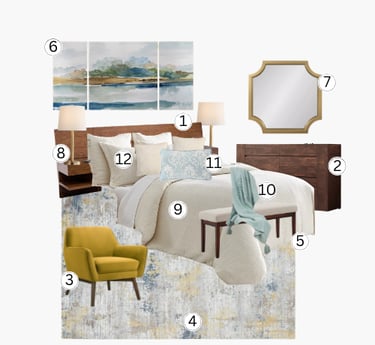
Furniture: Deep walnut tones anchor the room in a bed, matched nightstands, and a low six-drawer dresser, all sharing the same rich, warm-brown finish. The pieces stay low-profile and simple so the wood grounds the room without weighing it down. Against the bright wall color, the dark furniture reads as warmth rather than heaviness.
Lighting: A pair of brass table lamps with linen drum shades flank the bed for soft, even light. Their warm metal tone repeats in the gold-framed mirror across the room, keeping the fixtures visually connected to the rest of the accents. Nothing in the room competes with their glow... they're the only true light source doing visual work.
Materials: Velvet and chenille textiles soften the space against the walnut wood and brass metal. The mustard velvet chair and the ivory boucle bench bring in two different textures without adding pattern. Nothing glossy or hard-edged breaks up the softness.
DESIGNER'S NOTE
Dark furniture gets blamed for making a room feel small, but the wall color is usually the real problem. True aqua blue floods this space with light and keeps the walnut bed and dresser from ever reading as heavy. The wood grounds the room instead of shrinking it.
The brass lamps are the quiet thread that ties the whole room together. Their warm glow repeats in the gold mirror frame and the mustard chair, so nothing in the space feels like an isolated accent. It's the difference between a room that's bright and a room that's flat.
THE NEVER GUIDE
Never assume dark wood furniture will make a room feel smaller or heavier...the wall color around it decides that, not the wood itself.
Never match your metals to your wood tone exactly...let brass sit against the walnut instead of blending into it.
Never skip a patterned textile entirely, even in a bright room...one small floral or textured piece keeps ivory-on-ivory from going flat.

Three Homes Design participates in various affiliate marketing programs, which means we may earn a commission on products purchased through our links at no extra cost to you.